1000Mera
Brand communication and design
Context
1000Mera is a farming brand from İlkkurşun, a village in the Ödemiş district of İzmir. It aims to farm and raise livestock the right way, to benefit farmers in the region, and to help good farmers go on to make their own finished products.
Its range includes fermented sausage, pastes, additive-free flours, cold-pressed olive oil, and vegetables such as broccoli and cabbage. It also sells bundles that bring several products together; a pizza bundle is one of them. We worked on the brand's social media, print, e-commerce visuals and videos.
Approach
The brand comes from a village, so we wanted its visual language to come from there too. We tried to capture the feel of an Anatolian village with wood textures and bold type. Dark wood backgrounds and large white capitals ran through every piece, from the posts to the site banners to the cover of the export catalogue.
The product range is wide, so we kept the storytelling simple. You should be able to tell what a product is just by looking at the image.
Social media
The posts sit on dark wood, with bold, white, all-caps type. Discount and price tags follow the same layout. We drew a set of icons so each product's features could be read straight from the image.
Followers mostly watched stories, so we designed a separate story for every post. We also planned the Instagram grid as a whole and placed a farm column down the middle, where unedited photos from the farm and the production facility were shared.
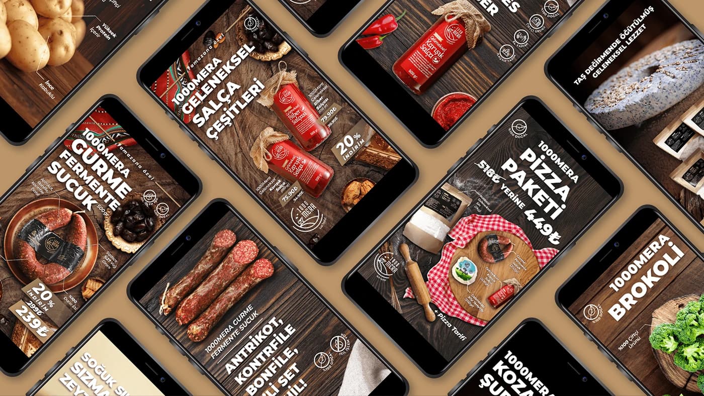
Instagram posts on a dark wood background
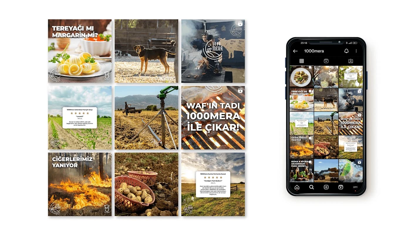
The farm column in the middle of the grid
Motion design for a campaign post
The thank-you card goes out with every order. Black background, gold lettering and a QR code. Its real job was to get customers to write a review of what they bought.
For trade fairs and business meetings we made a booklet that tells the brand's story and presents its products. Each product page has a QR code that opens that product's page on the site.
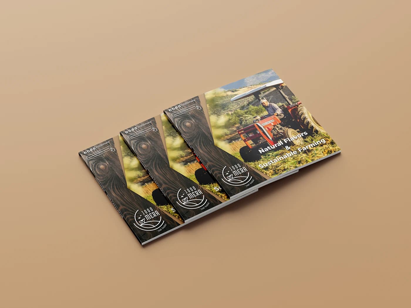
We designed the elevator ads to fit their frames, in a horizontal and a vertical version. The export catalogue was made to introduce the brand to bulk export customers. Rather than finished products, it mostly presents the crops and farm equipment supplied to other countries. Its cover has a wood texture, a round frame showing a farmer driving a tractor in a field, and the line "The Right Way of Farming".
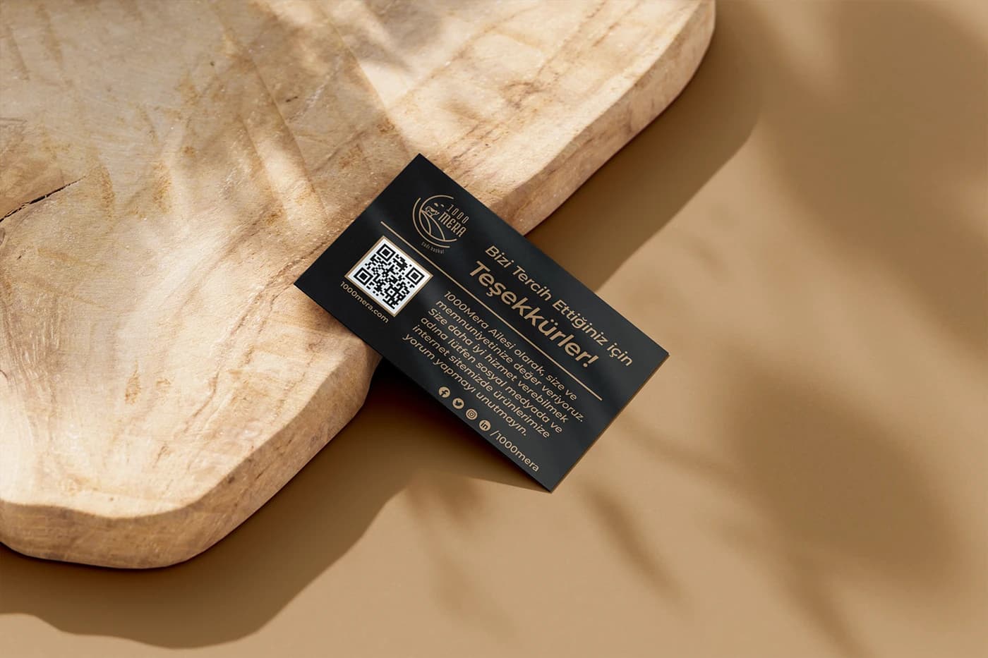
Thank-you card with a QR code, sent with every order
Cover of the booklet for trade fairs and business meetings
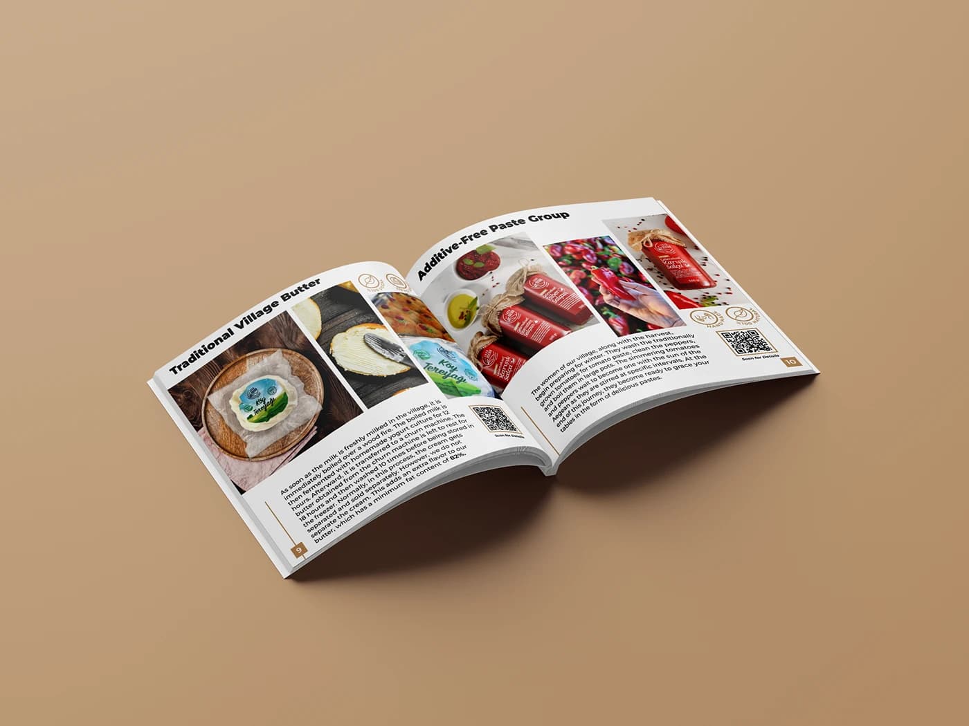
Inside pages of the booklet presenting the products
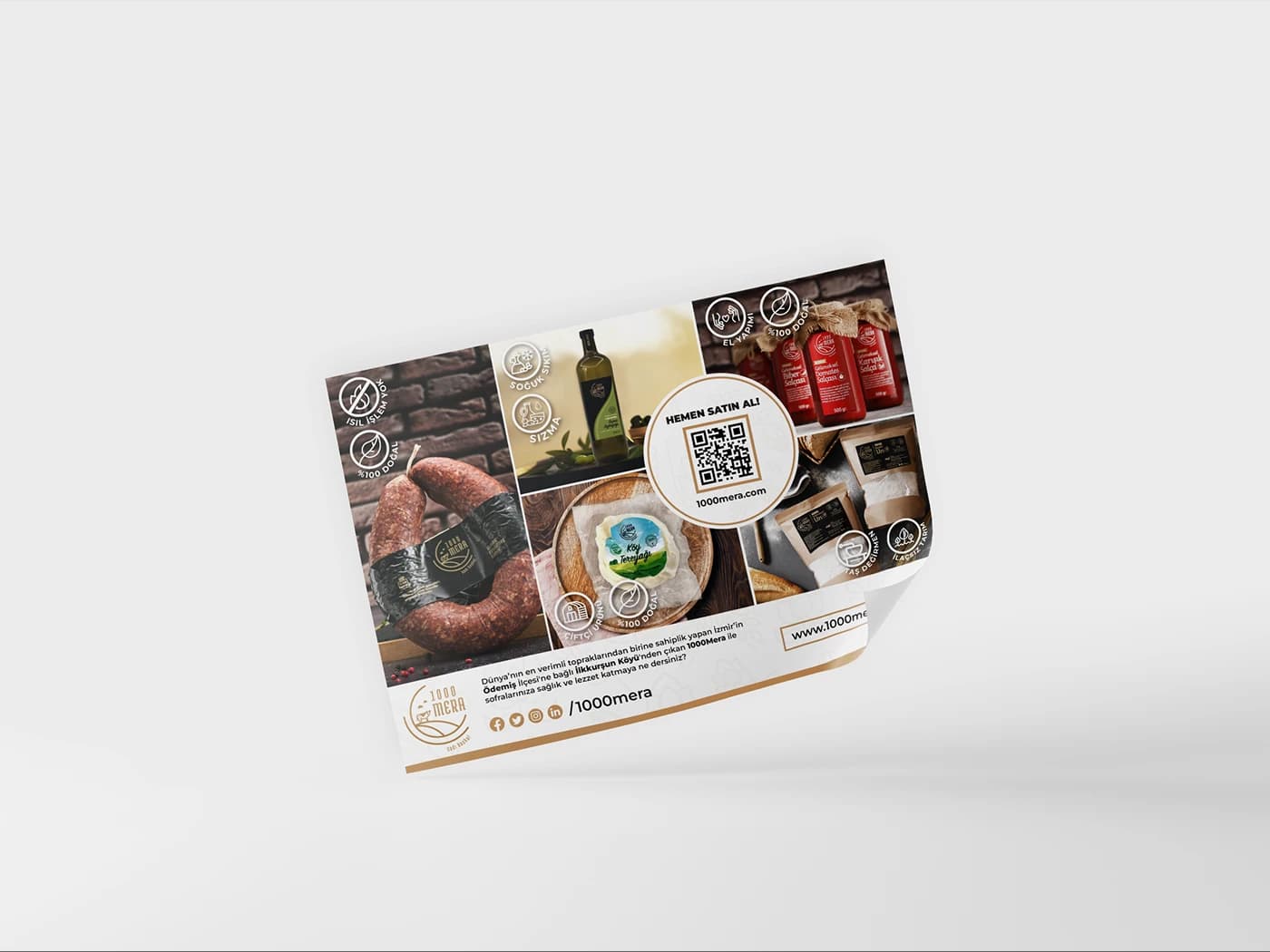
Flyer with product photos, feature icons and a QR code
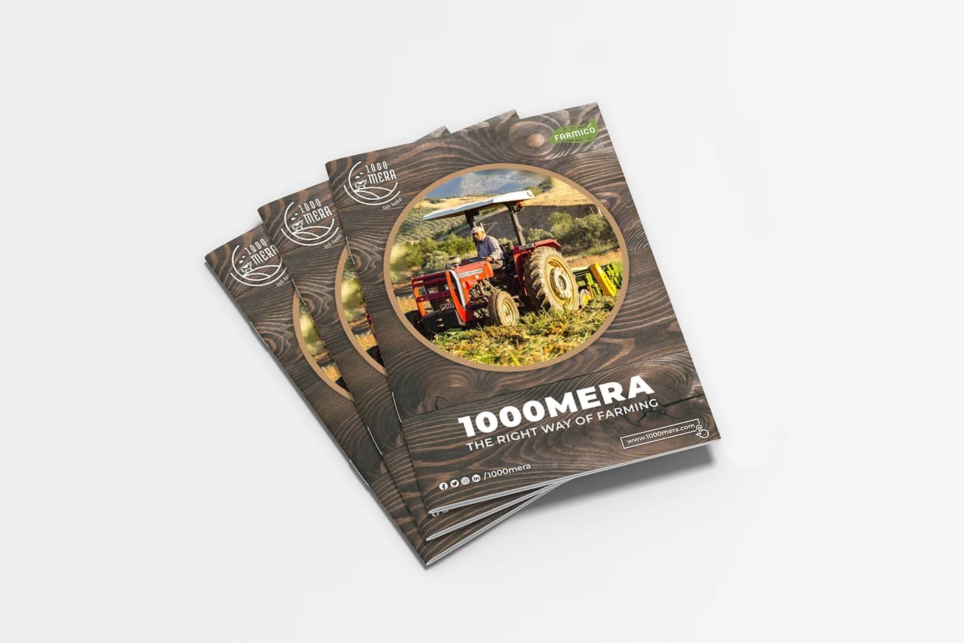
Cover of the export catalogue
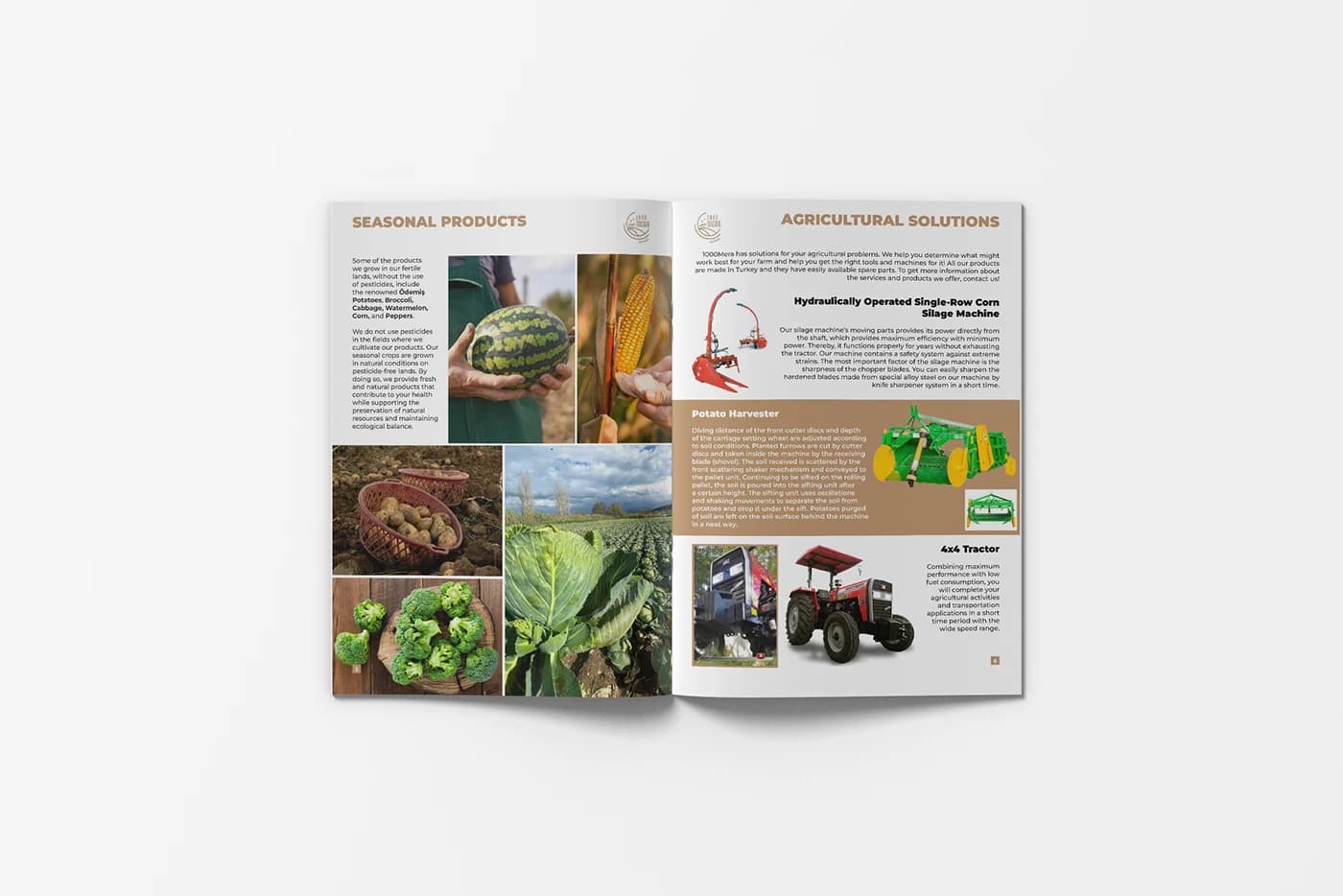
Export catalogue pages on crops and equipment
E-commerce and digital assets
On the e-commerce side we worked with the ikas platform. Its design options are limited, which meant building a clean, simple site. We designed the page layout, the sliding banners, part of the product photography and the monthly email newsletters.
The banners carry the same wood background and bold type as the posts, each with a "Go to product" button. One of them tells the story of the village itself: village and field photos pinned to a board, with the line "A Farming Story from İlkkurşun Village". We also wrote search-friendly blog posts to help the site rank higher.
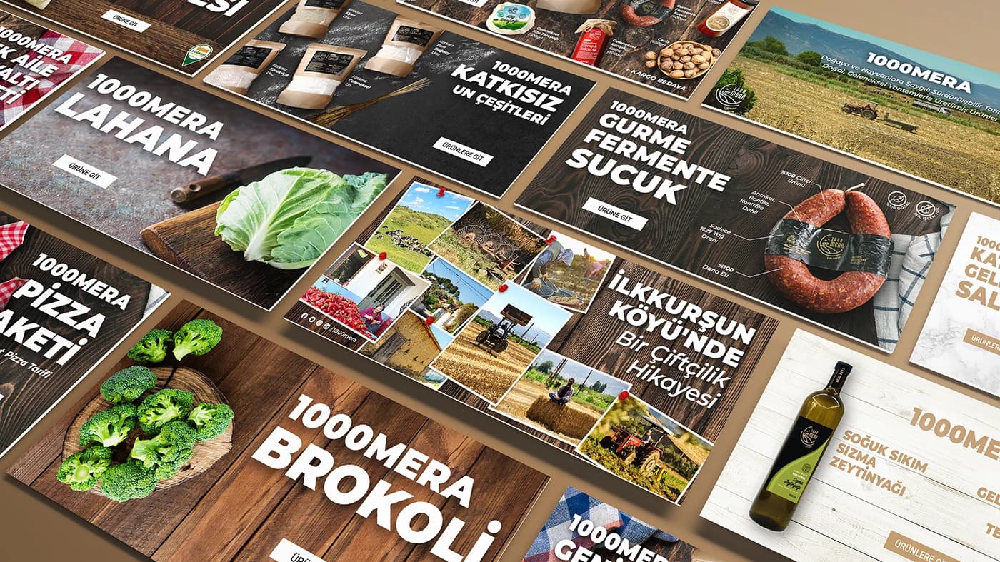
Product banners on wood and the banner about the village
Desktop view of the store page
Video
There isn't a single video here but a whole collection. We used bold type and fast editing. We made videos for national and special days, campaign videos for Ramadan, and other videos besides. Reels and ad creatives for seasonal campaigns and national days were part of the work too.
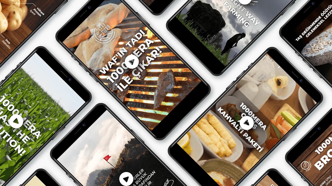
A frame from the video collection
Result
From posts to catalogues, from banners to videos, every piece used the same wood background and the same bold type. Our aim was simple: wherever the brand appeared, it should be clear that it came from a village.