Northlight
Logo and brand identity
Context
Northlight is a Turkish clothing brand that stands out for its embroidered designs. Its collection is mostly embroidered animals and characters.
The brief was clear: the logo had to be modern and simple, and easy to use on t-shirts.
Approach
We prepared several logo options. All of them were about the northern lights, and all of them used colour gradients. The chosen logo shows winding bands that recall the aurora inside a circle, with mountain peaks rising along its lower edge. The colour palette is a gradient running from turquoise to purple.
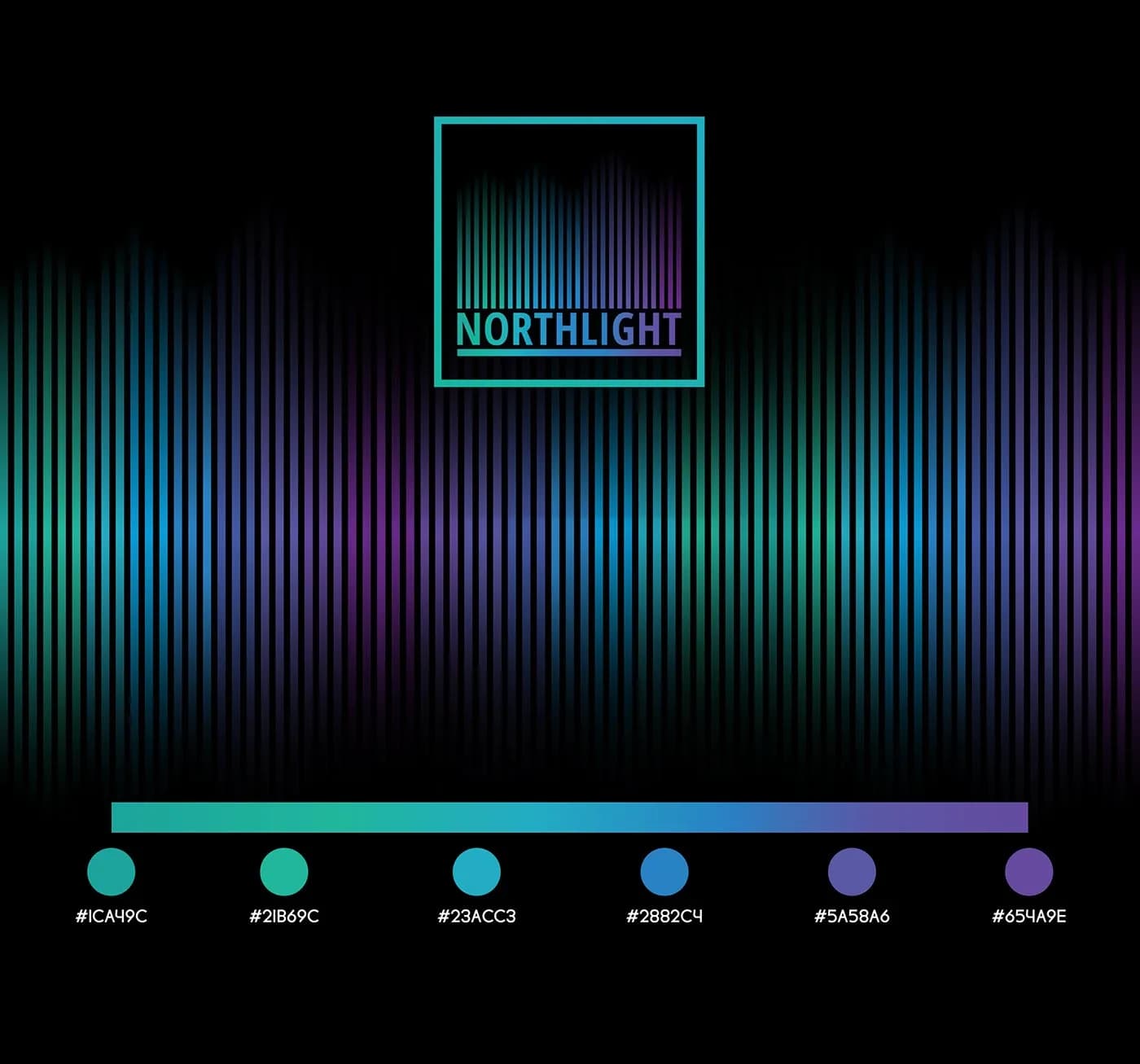
The second finalist option and the turquoise to purple palette
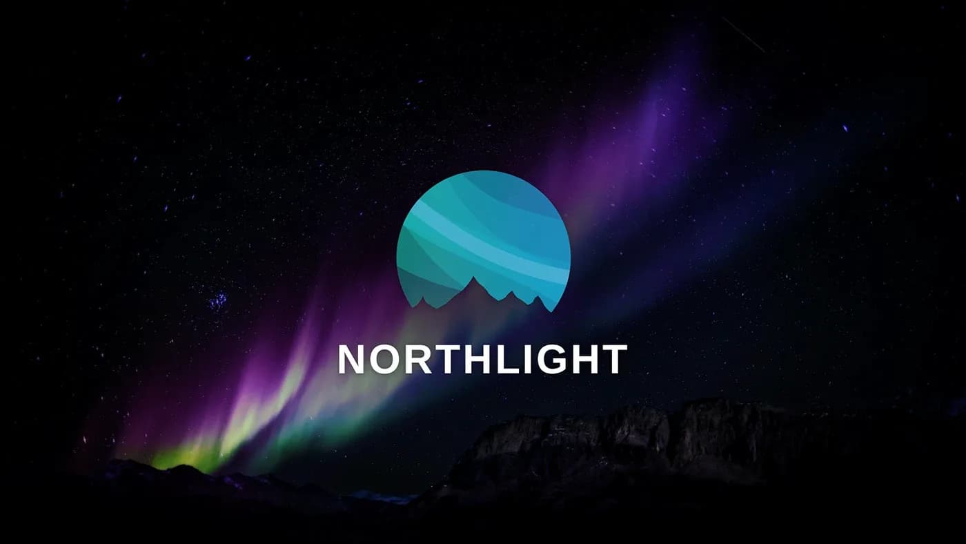
The chosen logo: northern lights and mountain peaks inside a circle
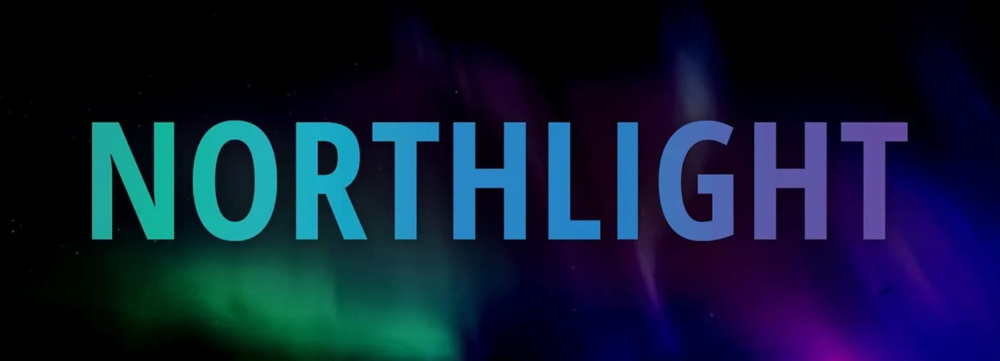
Gradient wordmark
On the t-shirts
Every t-shirt carries the logo embroidered in the bottom left corner. The product tag uses the same logo.
Two options made it to the final round. The one that wasn't chosen was a design we loved too; it described the northern lights in a simple, bold way. The brand didn't pick it as the logo, but the wordmark inside it became a t-shirt in the collection.
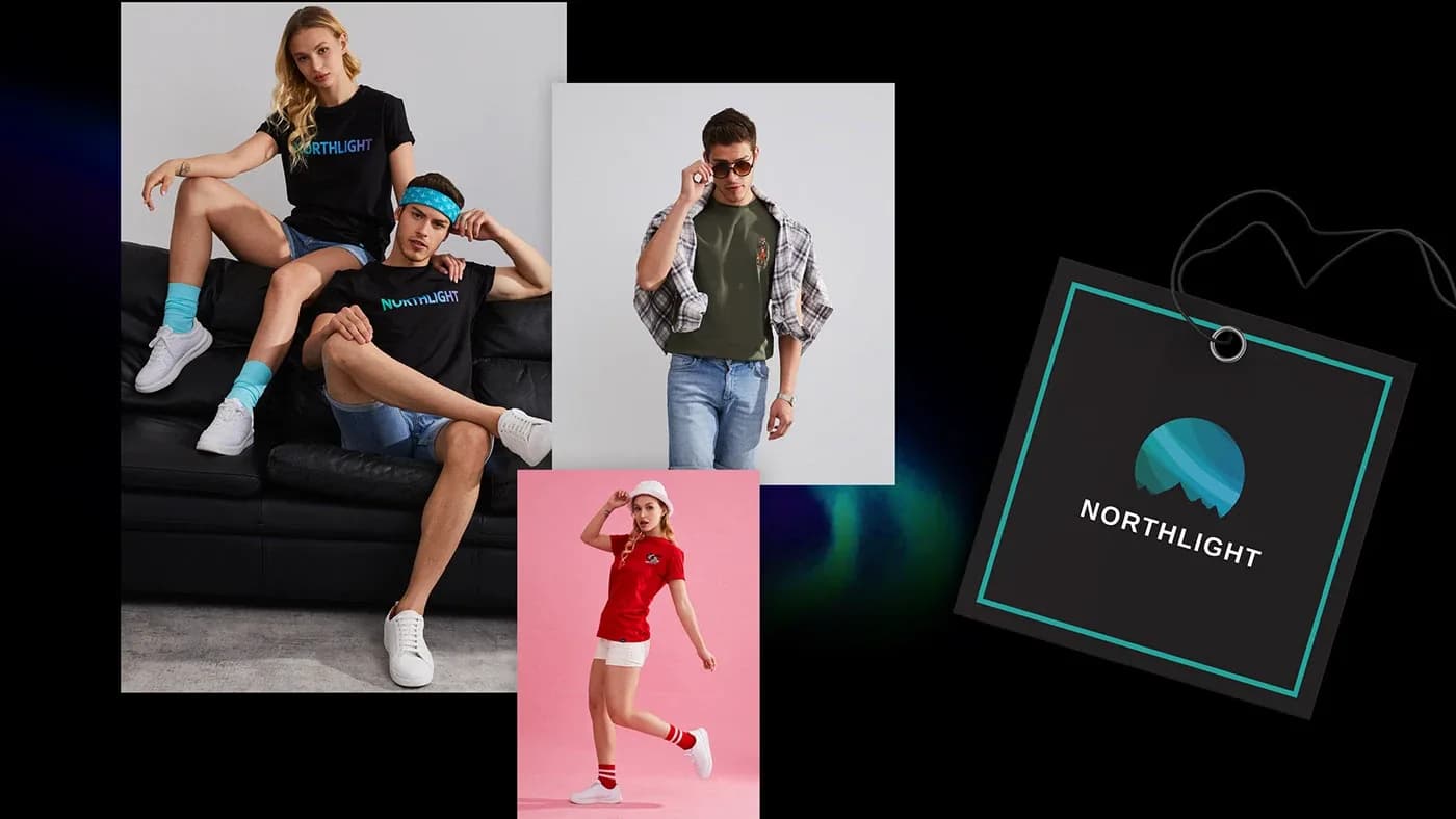
T-shirts from the collection and the logo tag
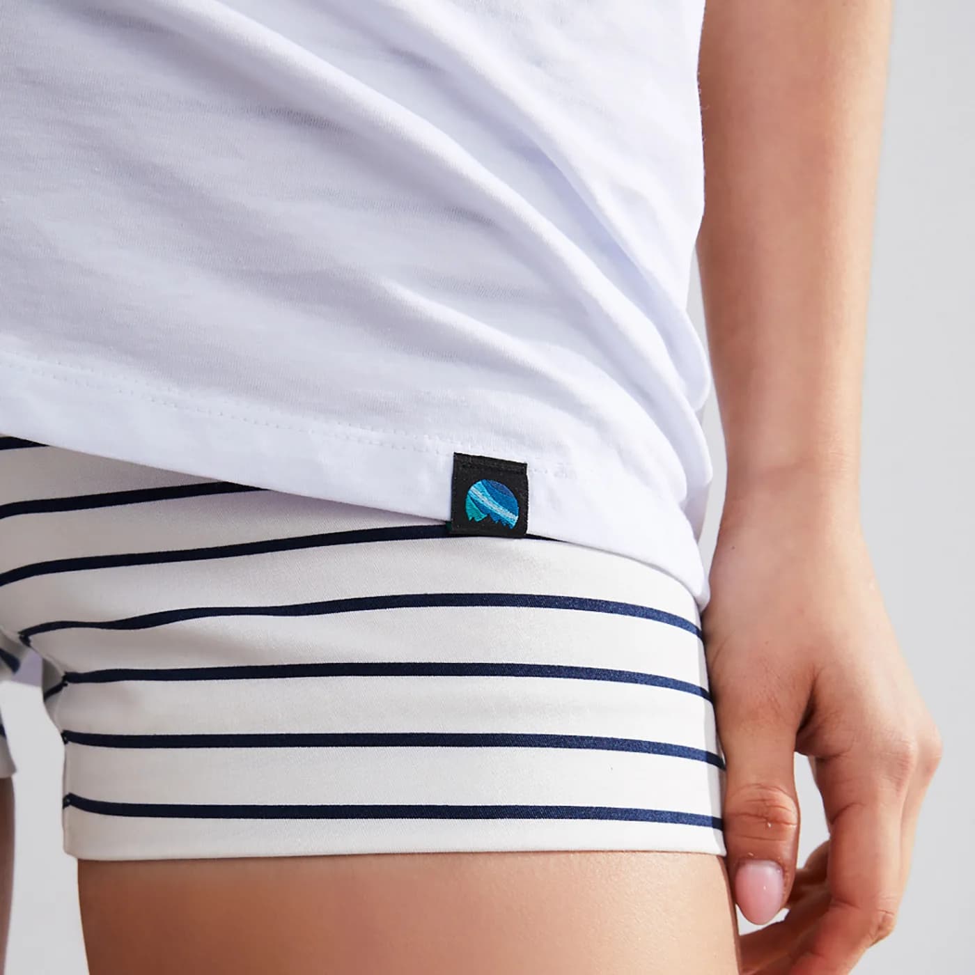
Logo label on the bottom corner of a white t-shirt
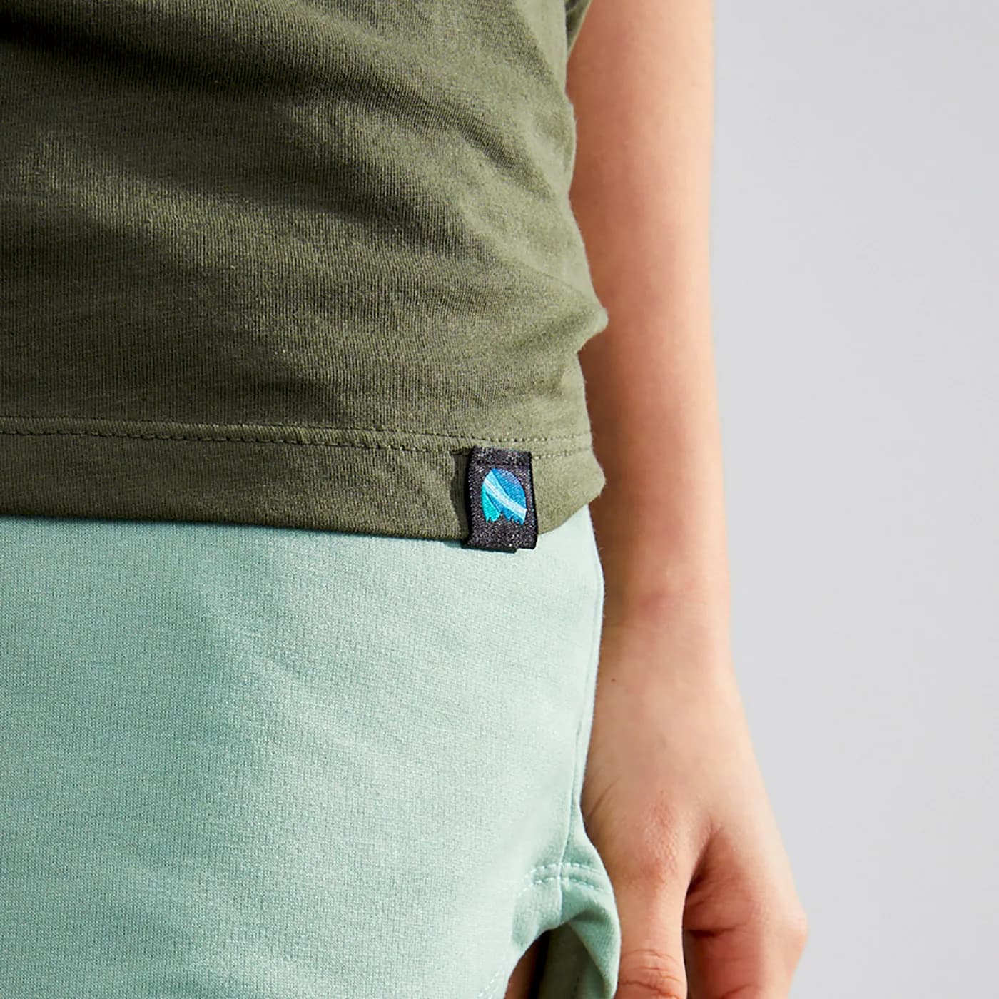
The same label on a khaki t-shirt
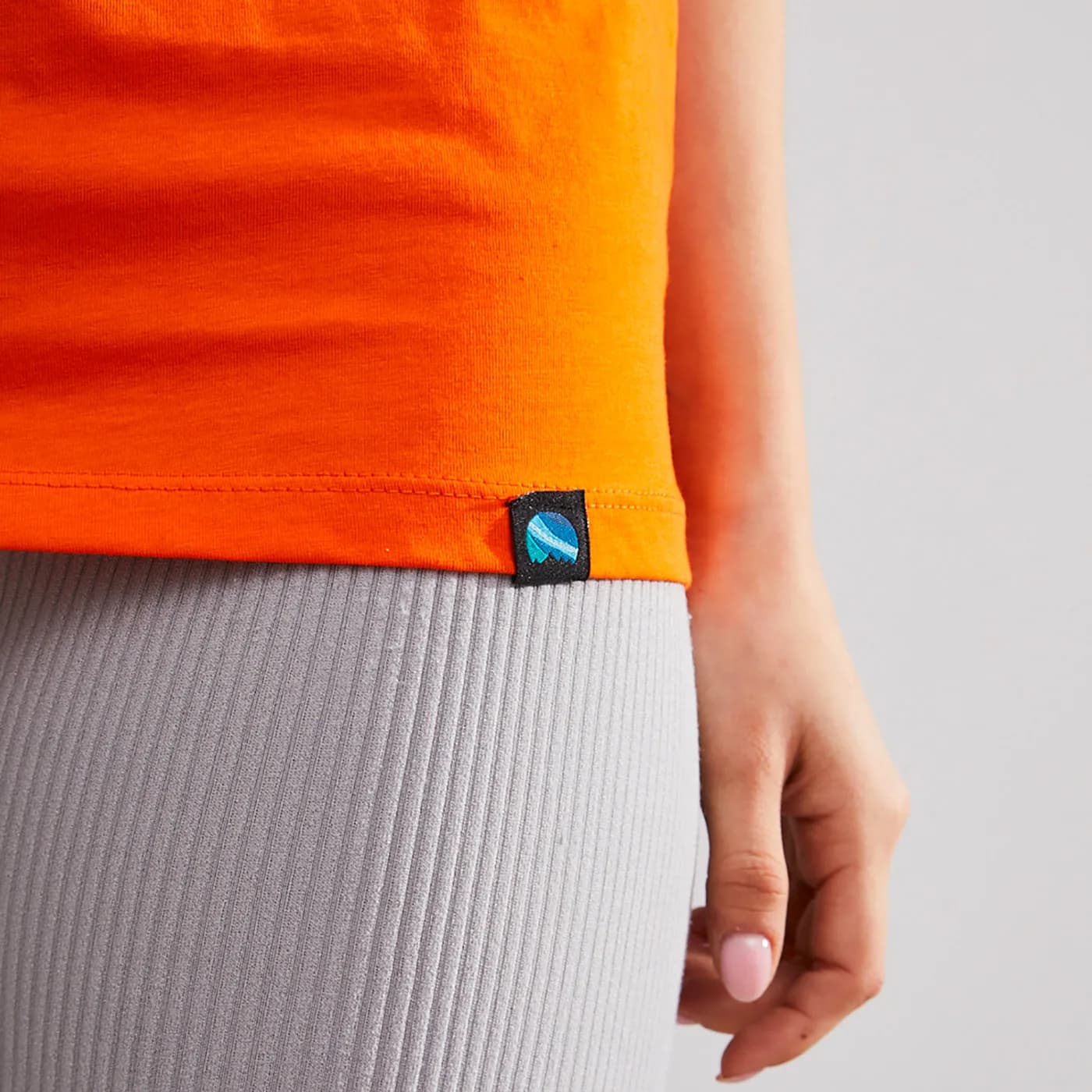
The same label on an orange t-shirt
Result
The logo, palette and wordmark all came from the same northern lights. The chosen logo sits in the corner of the t-shirts, while the wordmark of the other option ended up on the front of one.