Obsidyen Kreatif
Naming and brand identity
Context
Obsidyen Kreatif is a trade fair and event organisation company. It also does video production, live broadcasts, branding and social media management.
We suggested the name Obsidyen, Turkish for obsidian. The company prided itself above all on how solidly its team worked together, and that is why we chose it. The logo came from the same idea.
Approach
The logo shows six cubes sitting close together. Each one stands on its own, but together they form a single shape; that is where the idea of the team comes in. The wordmark next to it has two weights: "obsidyen" in bold, "kreatif" in light.
The logo has two versions for different uses. On black the cubes are drawn as outlines, on light backgrounds they are solid black.
Logo on black: cubes drawn as outlines
Logo on a light background: solid black cubes
Animated logo
We also made an animated version of the logo.
The animated logo
Black cubes line the bottom edge of the letterhead, and the same cubes appear in a very light grey in the middle of the page. The business card is square and black, with contact details and a QR code on the back. On the folder cover, cubes are scattered along the edge.
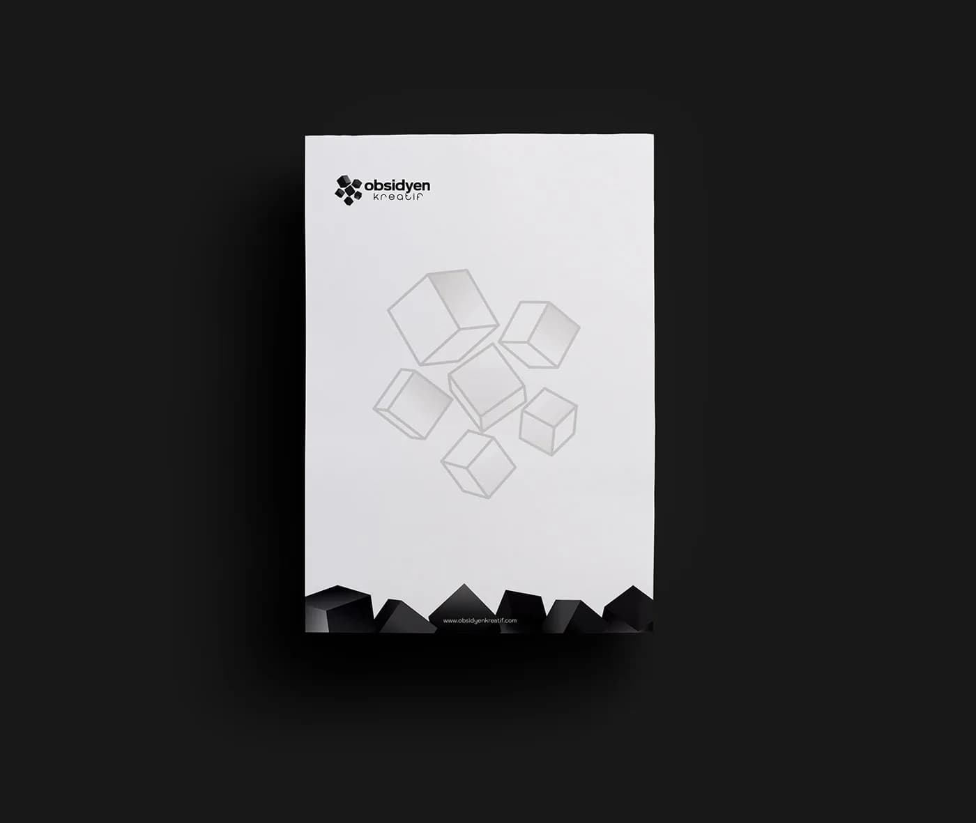
Letterhead with black cubes along the bottom edge
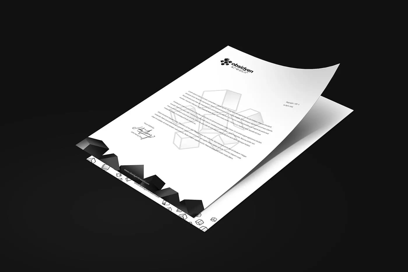
Text layout on the letterhead
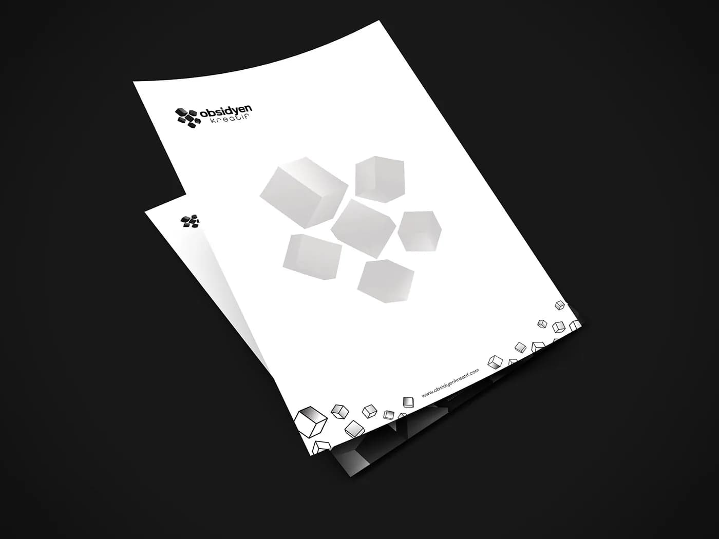
Letterhead, two views
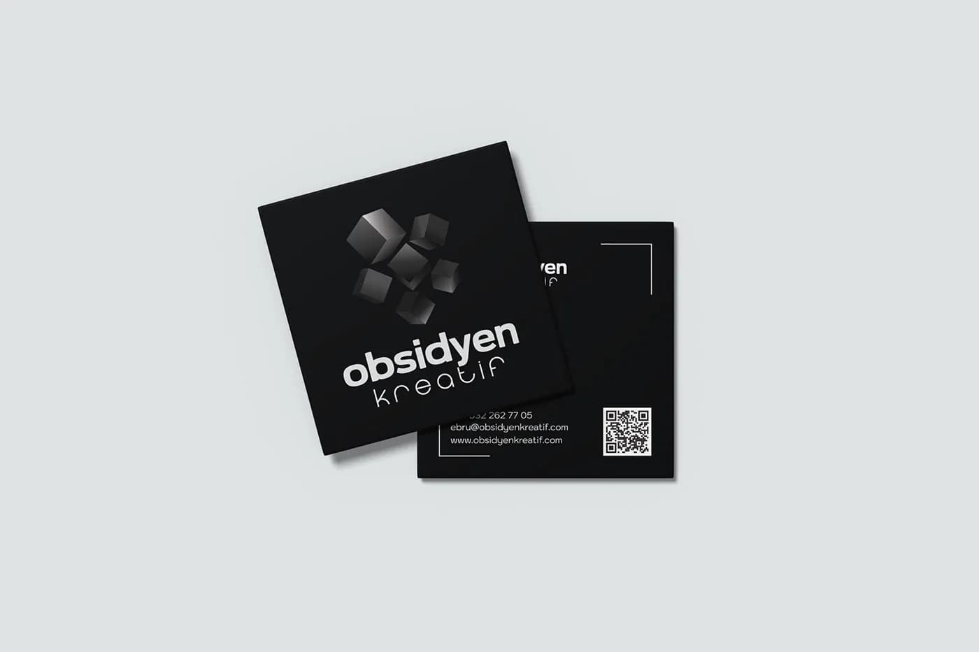
Front and back of the square business card
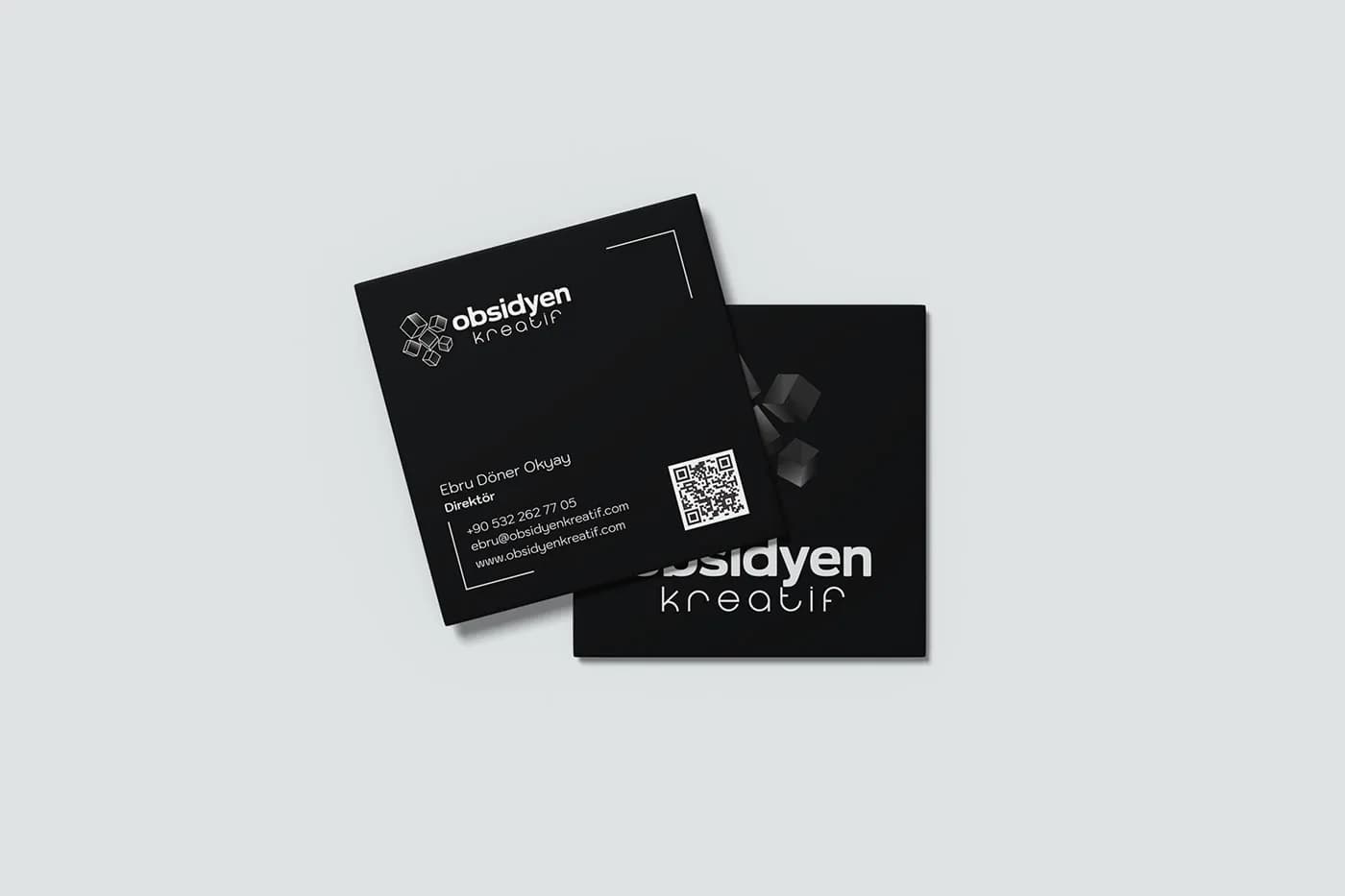
Business cards on a light background
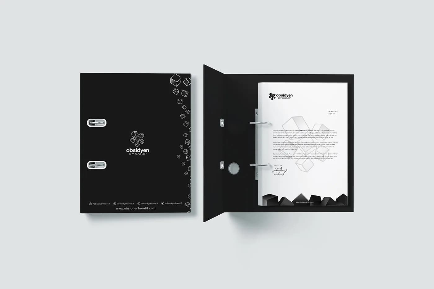
Outside and inside of the folder
Website and social media
We designed a one-page website where the company could show its work and its brand. We also ran its social media accounts. On the X and LinkedIn covers, the cubes are scattered across a black background.
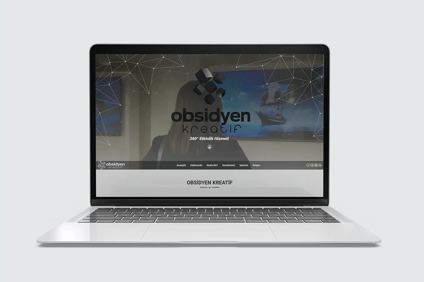
Opening screen of the one-page website
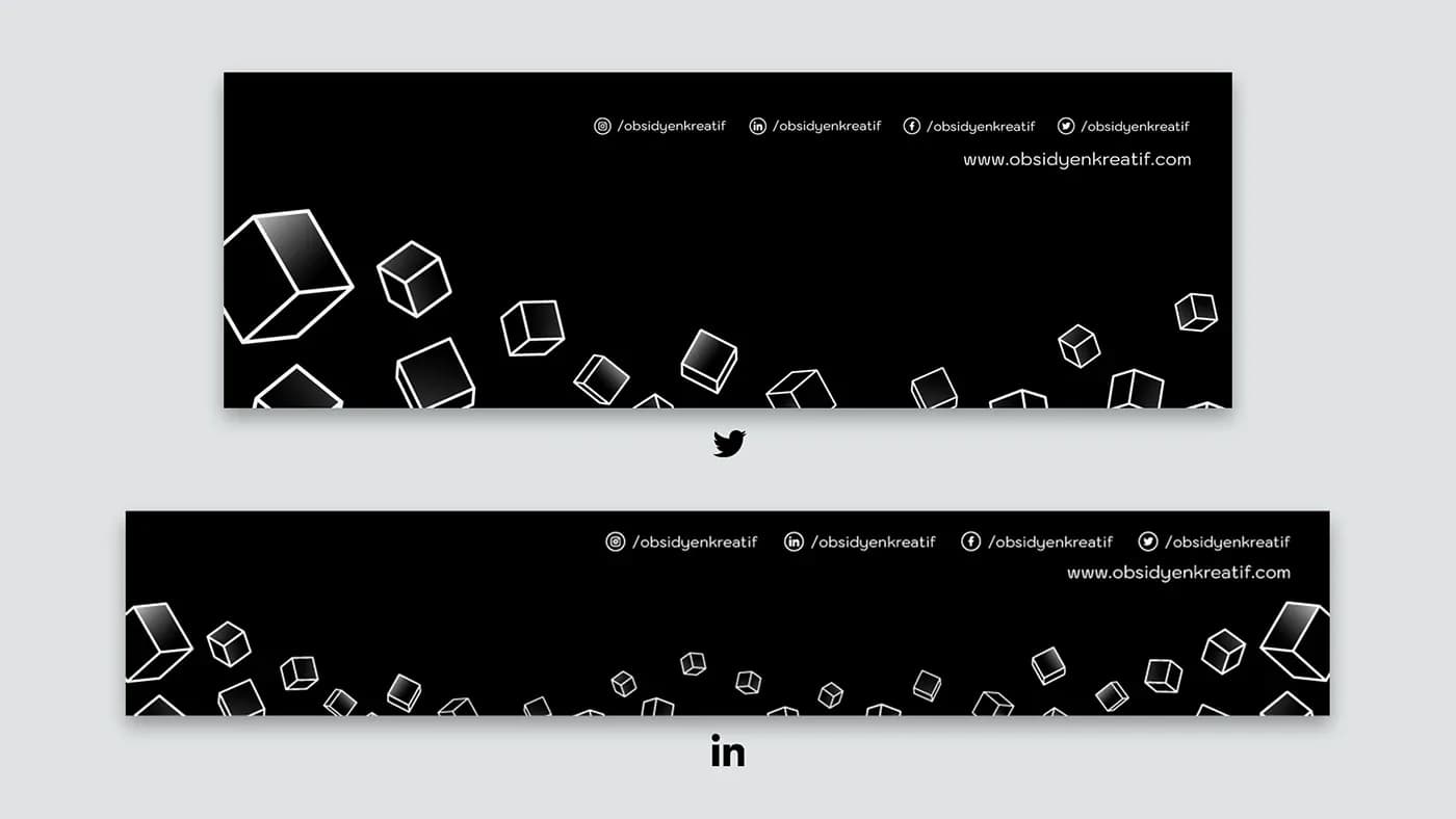
X and LinkedIn covers
Result
The name, logo, print materials, website and social media were all built from the same cubes. The team spirit the company is proud of lives in the logo itself.