SineSoft
Brand and packaging design
Context
SineSoft is a herbal hand disinfectant that moisturises hands while it cleans them. It takes its name from cineole, the active ingredient in eucalyptus oil. It comes in two variants: eucalyptus, and orange with eucalyptus.
Approach
We used two contrasting colours on the labels: orange and blue. The aim was to catch the eye, so that seeing the product would remind people to clean their hands. In one variant the label is blue with orange lines. In the other, it is the other way round.
The label is covered in winding lines that look like a fingerprint. A drawing of the cineole molecule also appears on the product.
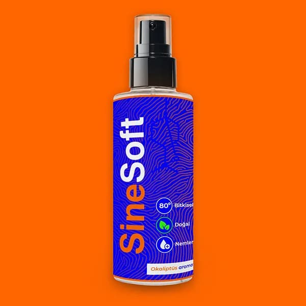
Eucalyptus variant: blue label, orange background
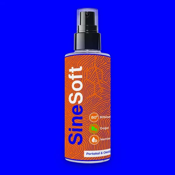
Bottle with an orange label, blue background
Logo
The mark next to the logo is a structural drawing of the cineole molecule. The name is split into two colours: "Sine" in one colour, "Soft" in white.
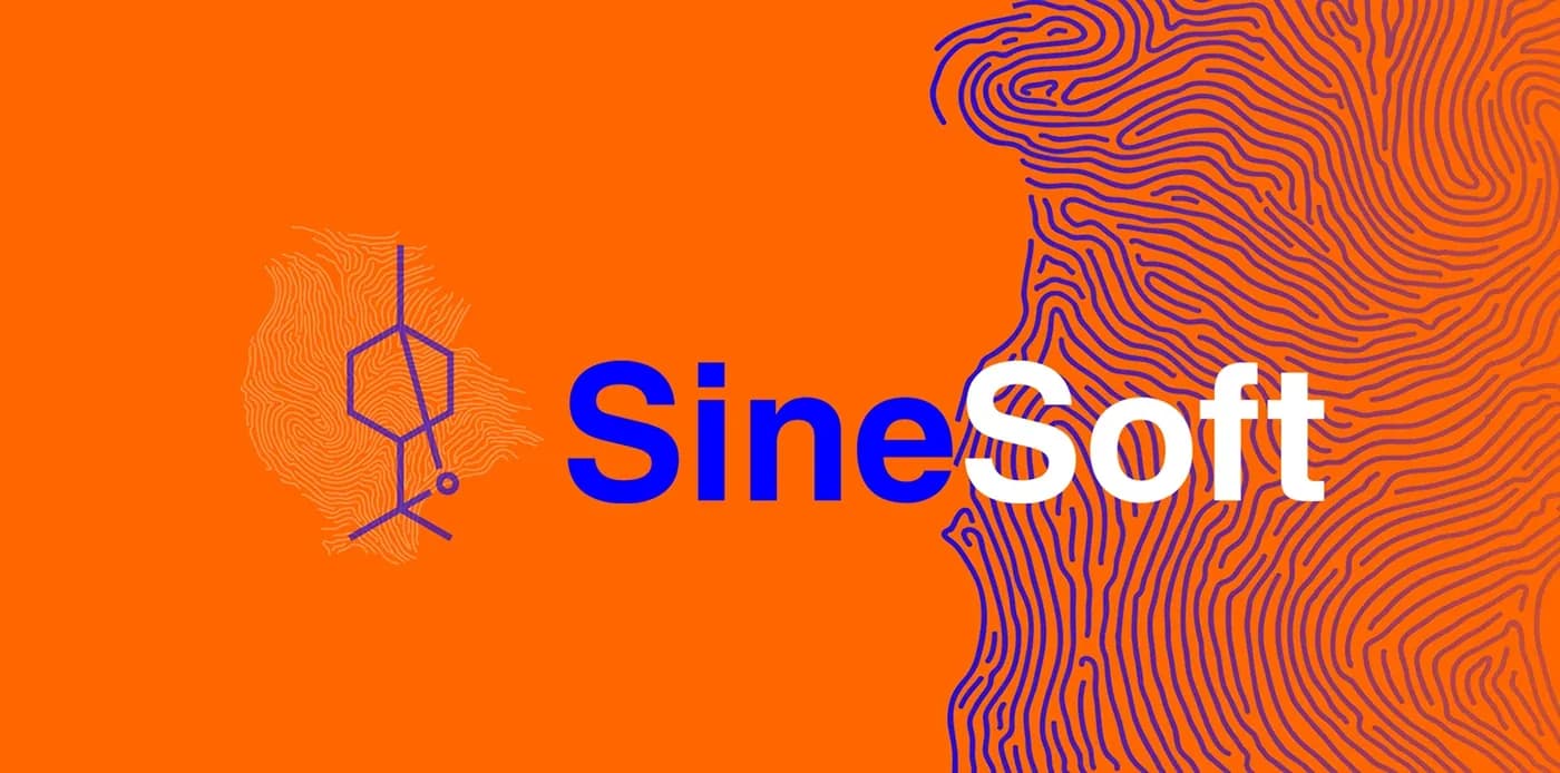
Mark drawn from the cineole molecule and the two-colour name
Packaging
On the front of the bottle the brand name runs vertically. Next to it are three icons: herbal alcohol, natural ingredients and moisturising. The back carries the directions for use, the ingredients and the barcode in the same layout. The band at the bottom of each bottle names the variant.
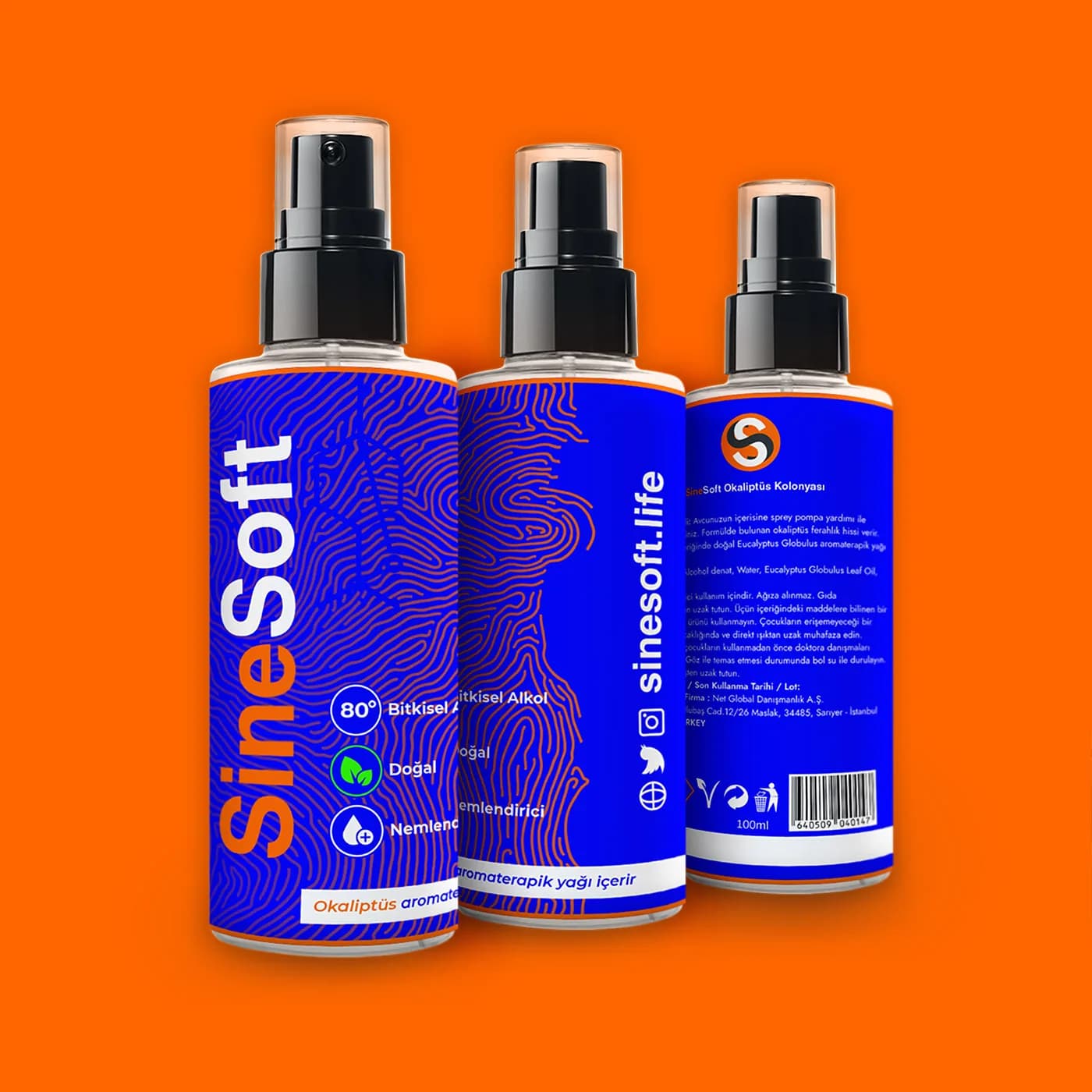
Front, side and back of the eucalyptus variant
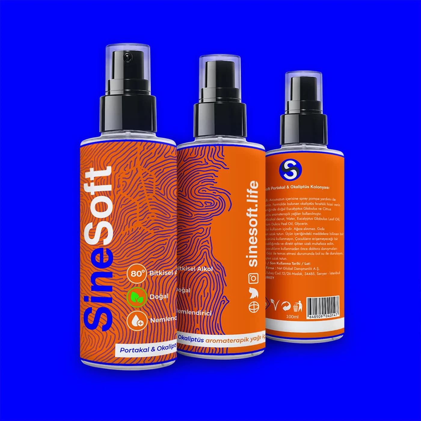
Front, side and back of the orange and eucalyptus variant
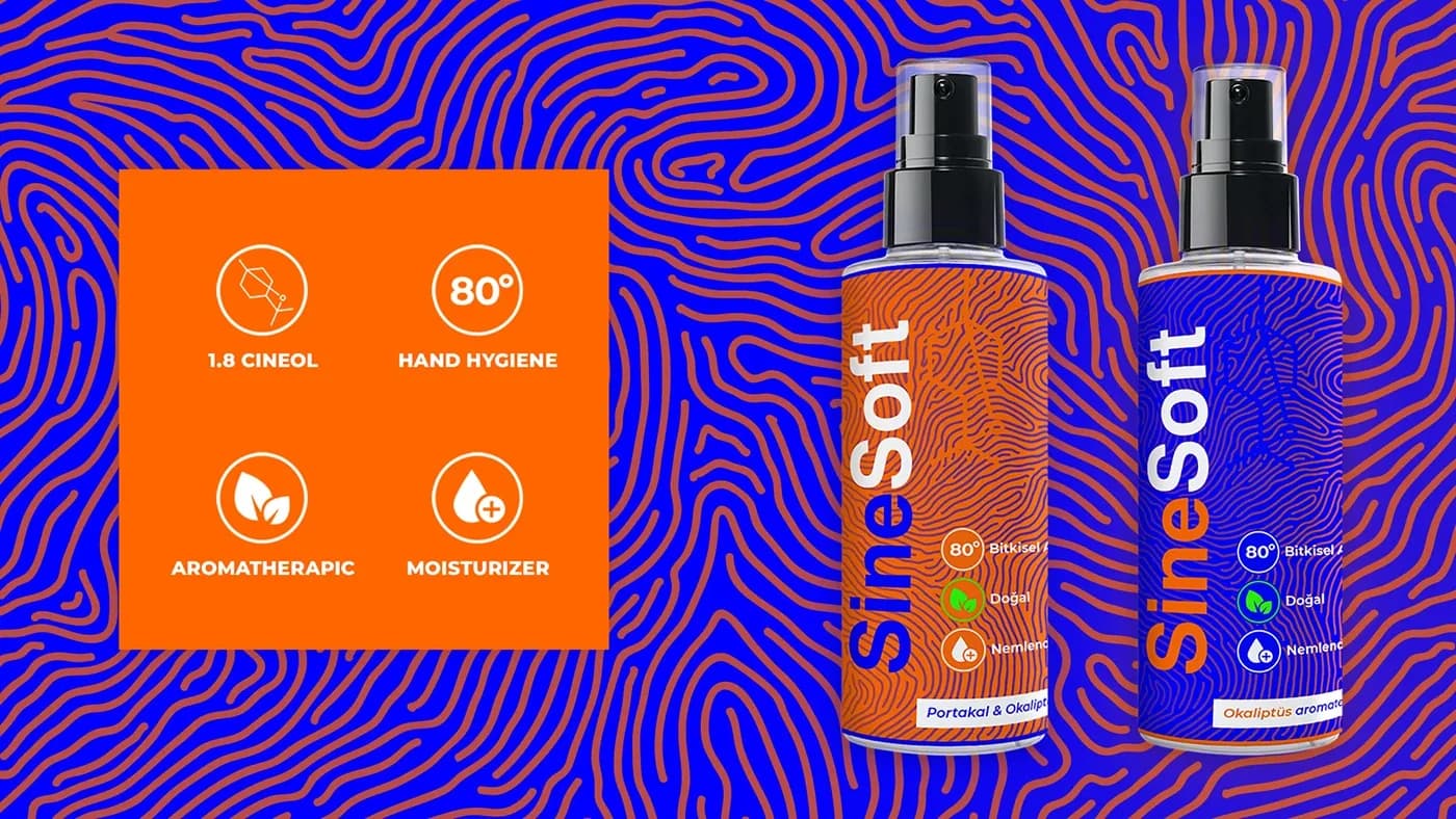
Fingerprint-like line pattern and the icons describing the product
Website
We designed a one-page website for the brand in the same colours. The opening screen also uses the cineole molecule and the fingerprint lines.
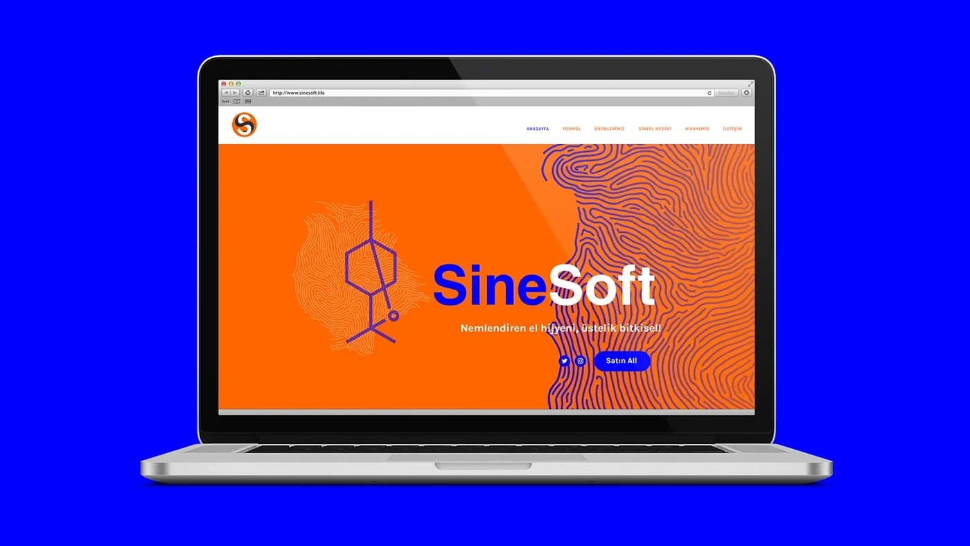
Opening screen of the one-page website
Result
Two colours, a line pattern and a molecule drawing: the label, logo and website were built from these three pieces. The two variants are told apart by swapping the colours.