Sympodium Institute
Brand identity
Context
Sympodium is a London-based, global institute for strategic communications. It focuses on the geopolitical side of the field and works with strategic communicators in government and civil society.
The colour palette had been set before the brand design began. We worked with that palette.
Approach
At the centre of the logo is an owl. We drew its body with parallel lines. The logotype is set in Priori Serif.
So the logo could work across different materials, we made several ways of using it. In one of them, the institute's name sits inside the owl's body, split over three lines.
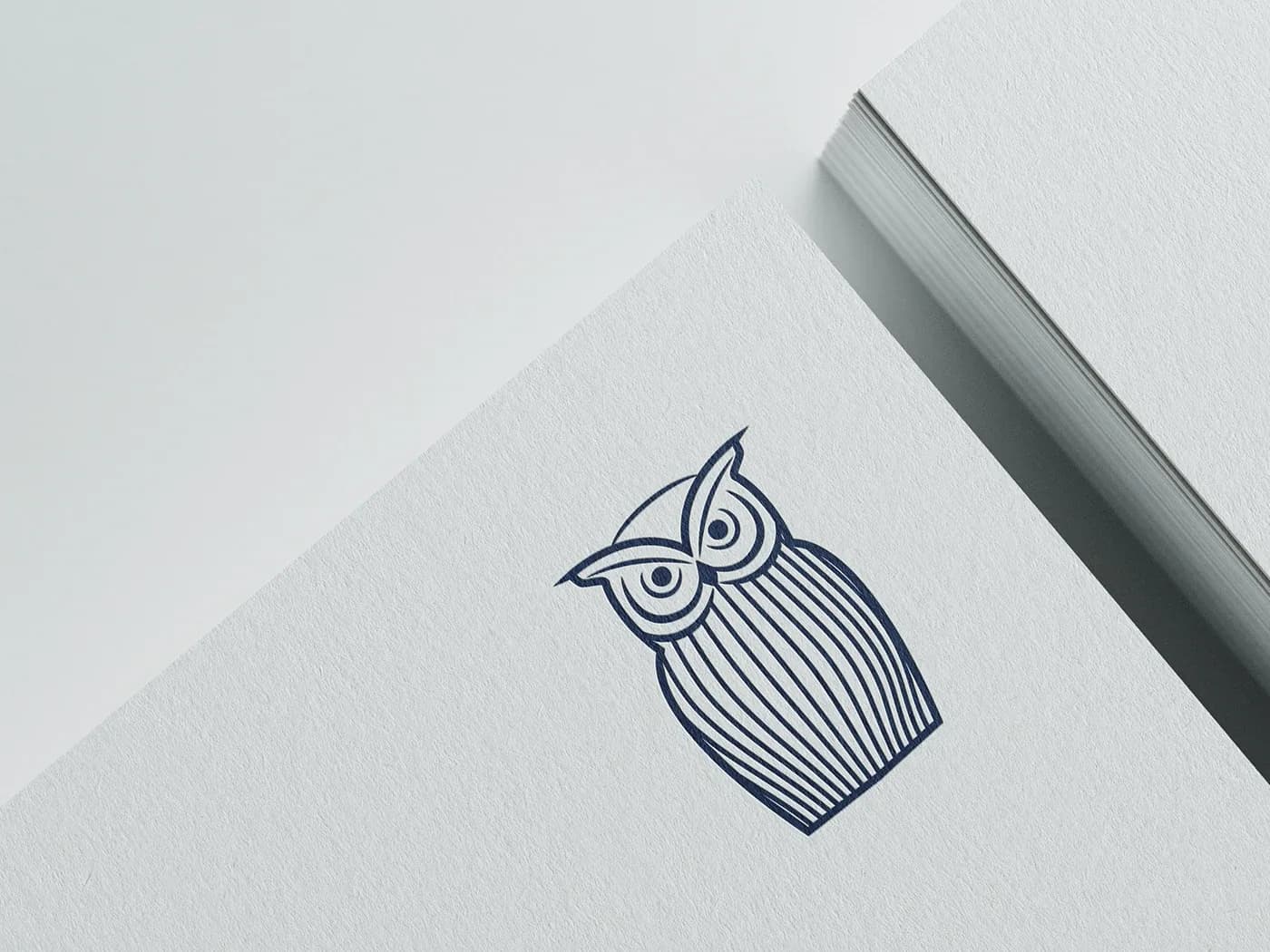
Owl drawn with parallel lines
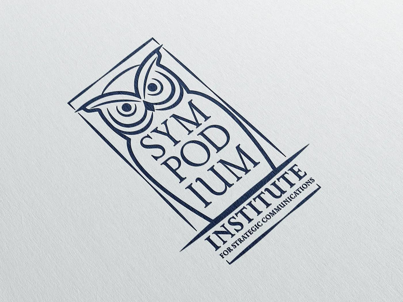
Version with the institute's name inside the owl's body
Logo versions
In the horizontal version the owl sits on the left and the institute's full name on the right. For narrow spaces there is also a text-only version inside a navy box, with the name split over three lines.
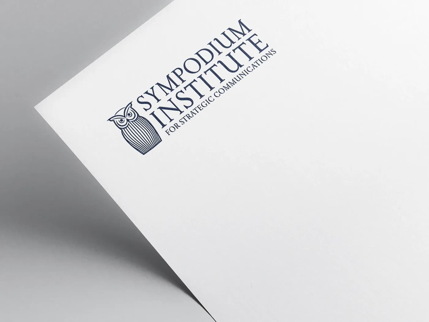
Horizontal version with the owl and the institute's full name
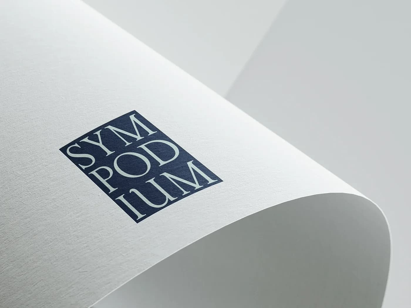
Text-only version with the name split over three lines
We made several letterhead options, a business card and an envelope. The business card is navy, the envelope pale green and the letterheads white. A few graphic elements were part of the set as well.
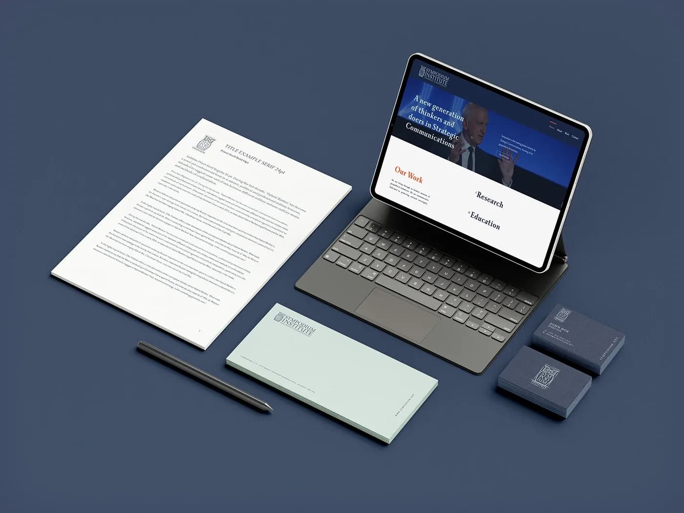
Letterhead, envelope and business card together
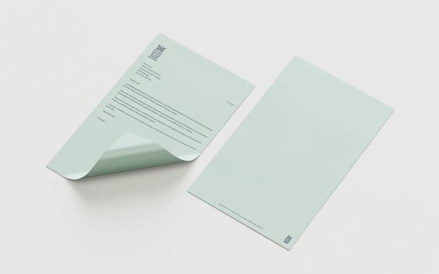
Pale green envelope and stationery
Annual
We designed a cover and binding for the institute's annual publication. The cover has a documentary-style portrait and the words "I. Annual" in large capitals. In the design, the title and logo on the spines line up when the volumes are stacked.
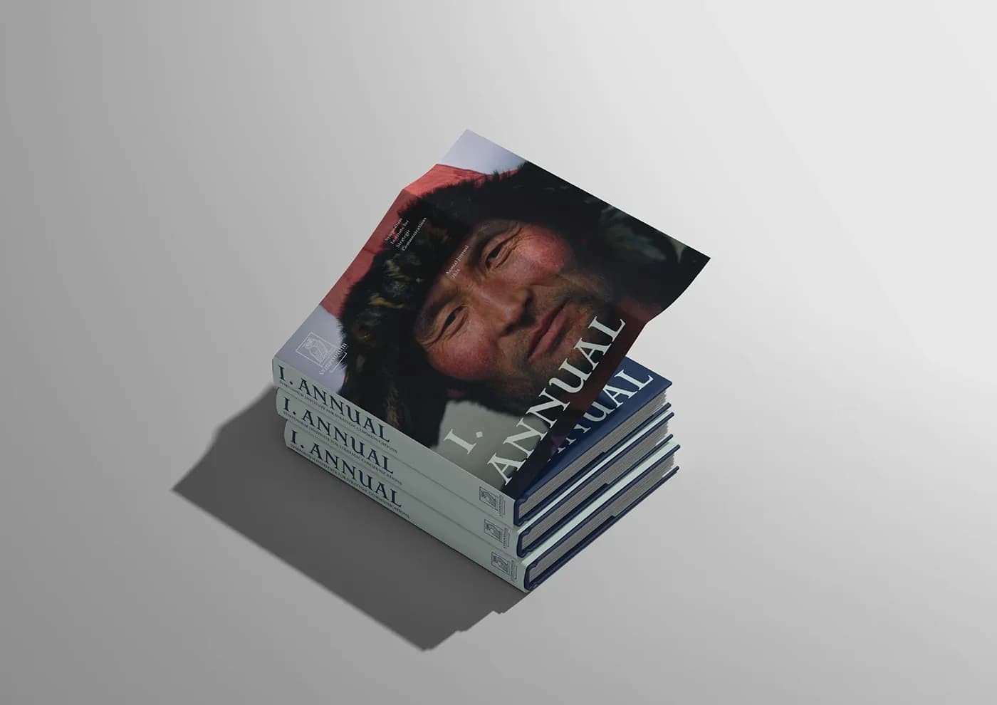
Cover and volumes of the annual
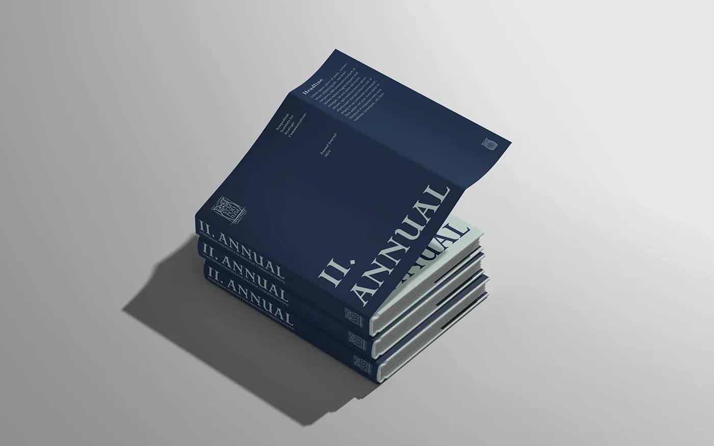
Spines of the navy volumes
Website
We carried the same language into the website design. The screens use the typeface, the navy and the owl from the print work.
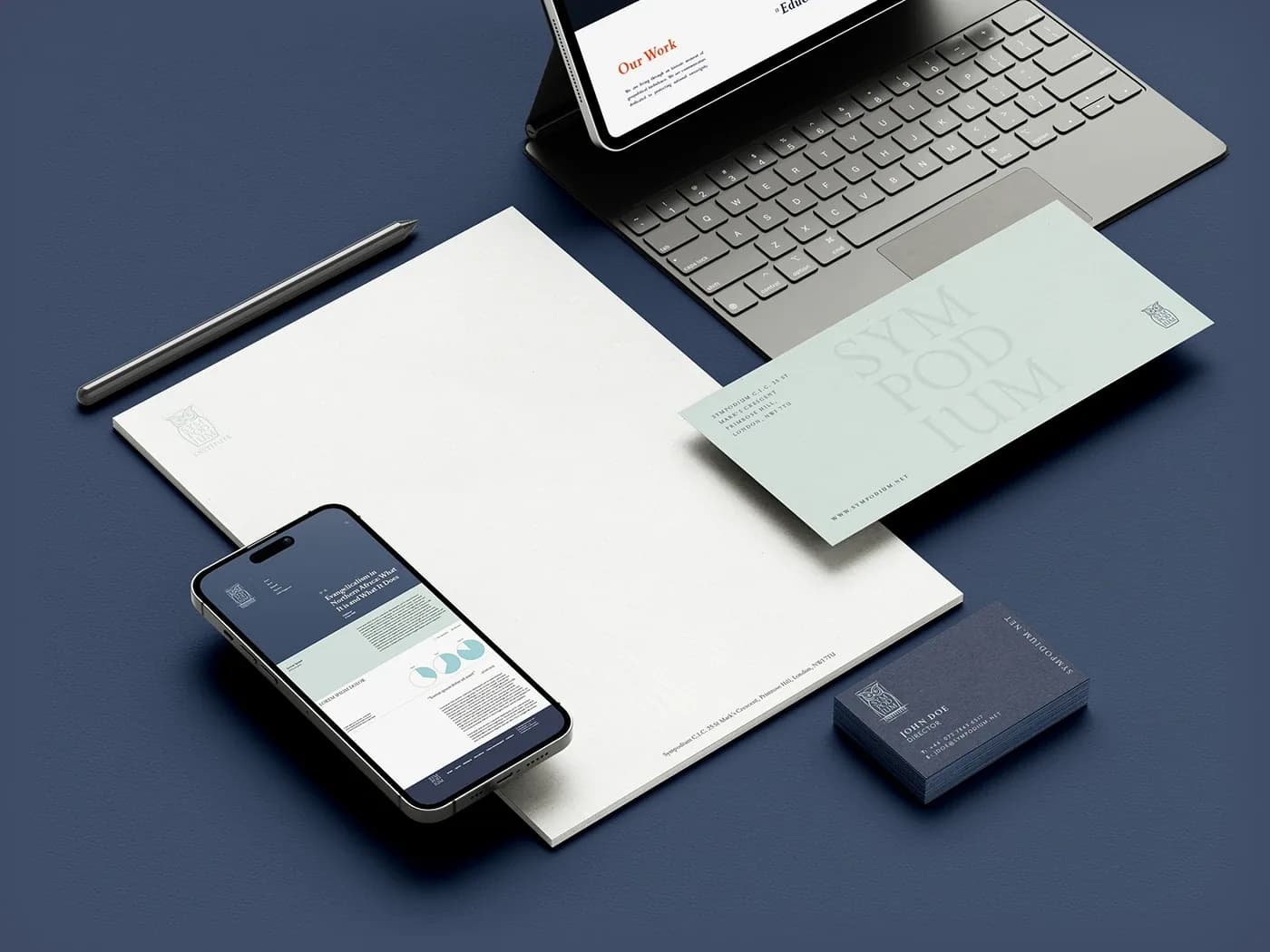
Print materials and website screens together
Result
The logo, letterheads, business card, envelope, annual cover and website were all designed with the same palette and typeface. Every piece we made belongs to the same family.